Graphs and tables about COVID-19 in Italy
After two years, I finally decided to stop updating this page and evaluation of all code blocks has been disabled. The data was last updated on October 28/2022.
The Italian Civil Protection keeps a Github repository with data about COVID-19 in Italy. In March 2020 I began using the repository to plot the evolution of the pandemic in Italy. It started as an exercise where I could use literate programming to understand better the evolution of the pandemic in Italy. It ended up with pages collecting a couple of years of data.
Here you get an high level overview of the information collected; click on the plots to view more detailed analyses and examples of literate programming using Org Mode.
Situation at a glance
Get the data from the Github repository:
export REPO="https://raw.githubusercontent.com/pcm-dpc/COVID-19/master"
curl ${REPO}/dati-regioni/dpc-covid19-ita-regioni.csv > data/dpc-covid19-ita-regioni.csv
curl ${REPO}/dati-andamento-nazionale/dpc-covid19-ita-andamento-nazionale.csv > data/dpc-covid19-ita-andamento-nazionale.csv
curl ${REPO}/dati-regioni/dpc-covid19-ita-regioni-latest.csv > data/dpc-covid19-ita-regioni-latest.csv
We now start an R session, using the setwd function to set the
working directory. The session is then used by the R source blocks
defined in files in this directory.
Make sure you change the absolute path used in
setwdif you want to execute this code on your computer.
| cols | X978 |
|---|---|
| data | 2022-10-28T17:00:00 |
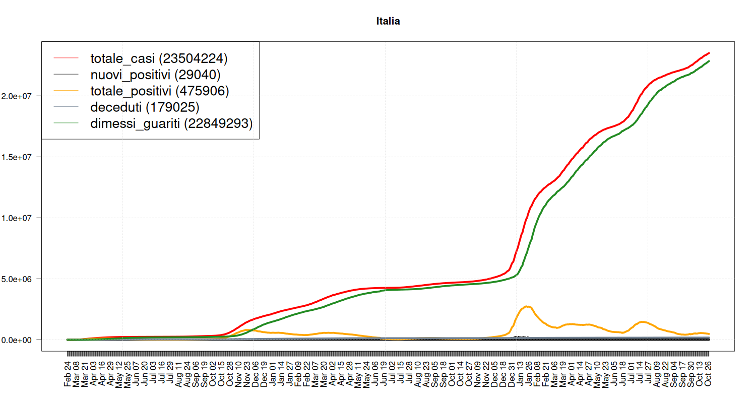
| nuovi_positivi | 29040 |
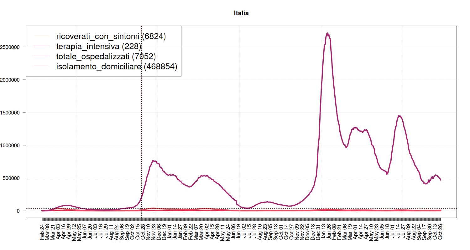
| ricoverati_con_sintomi | 6824 |
| terapia_intensiva | 228 |
| totale_ospedalizzati | 7052 |
| isolamento_domiciliare | 468854 |
| totale_positivi | 475906 |
| totale_casi | 23504224 |
Detailed Information
If you want more information, click on the plots below.
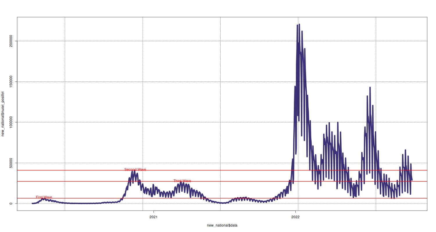
New Cases
Click on the graph and go to the dedicated page.
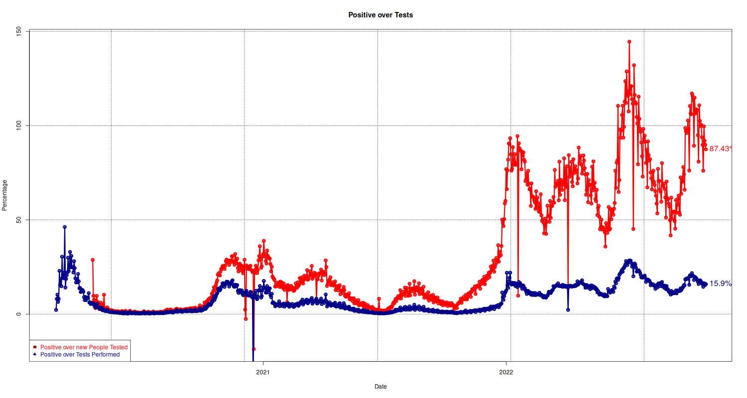
People Tested and Tests
Click on the graph and go to the dedicated page.
Overall Situation in Italy
Click on the graphs below and go to the dedicated page.
There are many other places where you can find similar plots and data: the ones I usually consult are listed in the bookmarks page.
The source code available on the COVID-19 pages is distributed under the MIT License; the content is distributed under a Creative Commons - Attribution 4.0.