Overall Situation in Italy
Table of Contents
After two years, I finally decided to stop updating this page and evaluation of all code blocks has been disabled. The data was last updated on October 28/2022.
Introduction
This page contains various plots generated using Org Mode and R: no fancy web services, just plain-old off-line generation. On top of being an interesting exercise on R and literate programming in Emacs, I use this page to get an idea of the evolution of the pandemic in Italy.
This page was created on and regularly updated since then.
R Functions
This section contains the code for plotting data. The function my_plot
plots different variables of an input dataframe over time, optionally
filtering over region, which is the denomination of an Italian region.
The optional argument max defines the maximum value for the x-axis, while
the optional Boolean arguments textlabels and filter control,
respectively, whether text labels are printed on graphs and data has to be
filtered by Region.
Finally, the optional arguments variables, graphtypes, and colors are
vectors, defining, respectively, the variables to plot, the type of plot, and
the colors used.
my_plot <- function(region, data, max=-1, textlabels=TRUE, filter=FALSE,
                    variables  = c("totale_casi", "nuovi_positivi", "totale_positivi", "deceduti", "dimessi_guariti"),
                    graphtypes = c("l", "h", "l", "l", "l"),
                    colors     = c("red", "black", "orange", "slategrey", "forestgreen")) {
  par(cex=1.40, las=2)

  # if asked to filter, filter data according to region
  if (filter) {
    dataframe <- subset(data, denominazione_regione == region)
  }
  else {
    dataframe <- data
  }

  if (max == -1) {
    max=max(dataframe$totale_casi)
  }

  plot(x=1,
       xlim=c(min(data$data), max(data$data)),
       ylim=c(0,max),
       type="n",
       main = region,
       xlab="",
       ylab="",
       xaxt="n")

  axis.Date(1, at=dataframe$data, by="days", format="%b %d")

  # do the plots, now
  for (i in 1:length(variables)) {
    lines(x=dataframe$data, y=dataframe[, variables[i]],
          type=graphtypes[i],
          lwd=5,
          pch=16,
          col=colors[i])
    if (textlabels) {
      text(x=dataframe$data, y=dataframe[, variables[i]],
           label=dataframe[, variables[i]],
           pos=2,
           col=colors[i])
    }
  }

  values = sprintf("(%s)", dataframe[nrow(dataframe), variables])
  legend("topleft", legend=paste(variables, values), col=colors, lty=1, cex=1.6)
  grid(col = "lightgray")
}
Then we read the data from the CSV files of the Civil Protection repository:
# evolution over time, by Region
data = read.csv(file.path(PATH, "dpc-covid19-ita-regioni.csv"))
data$data <- as.Date(data$data)

# evolution over time at the National level
national = read.csv(file.path(PATH, "dpc-covid19-ita-andamento-nazionale.csv"))
national$data <- as.Date(national$data)

# latest regional data
latest = read.csv(file.path(PATH, "dpc-covid19-ita-regioni-latest.csv"))
latest$data <- as.Date(national$data)
We are now ready to print and plot the data.
This Week in Italy
cols = c(
  "ricoverati_con_sintomi",
  "terapia_intensiva",
  "totale_ospedalizzati",
  "isolamento_domiciliare",
  "totale_positivi",
  "nuovi_positivi",
  "dimessi_guariti",
  "deceduti",
  "totale_casi"
)
labels = c(
  "In hospitals with symptoms",
  "In ICUs",
  "Total hospitalized",
  "Quarantined at home",
  "Active cases",
  "New cases",
  "Recovered",
  "Deaths",
  "Total number of cases"
)

Today = unlist(national[nrow(national), cols])
Yesterday = unlist(national[nrow(national) - 1, cols])
TwoDaysAgo = unlist(national[nrow(national) - 2, cols])
ThreeDaysAgo = unlist(national[nrow(national) - 3, cols])
FourDaysAgo = unlist(national[nrow(national) - 4, cols])
FiveDaysAgo = unlist(national[nrow(national) - 5, cols])

output_frame <- data.frame(labels, FiveDaysAgo, FourDaysAgo, ThreeDaysAgo, TwoDaysAgo, Yesterday, Today)
colnames(output_frame) <- rev(seq(Sys.Date(), by="-1 day", length.out=7))
colnames(output_frame)[1] <- "Label"
output_frame
| Label | 2022-10-24 | 2022-10-25 | 2022-10-26 | 2022-10-27 | 2022-10-28 | 2022-10-29 |
|---|---|---|---|---|---|---|
| In hospitals with symptoms | 7017 | 7124 | 7106 | 7019 | 6881 | 6824 |
| In ICUs | 229 | 226 | 232 | 227 | 223 | 228 |
| Total hospitalized | 7246 | 7350 | 7338 | 7246 | 7104 | 7052 |
| Quarantined at home | 512551 | 501090 | 492661 | 491023 | 477137 | 468854 |
| Active cases | 519797 | 508440 | 499999 | 498269 | 484241 | 475906 |
| New cases | 25554 | 11606 | 48714 | 35043 | 31760 | 29040 |
| Recovered | 22649684 | 22672607 | 22729641 | 22766314 | 22812006 | 22849293 |
| Deaths | 178594 | 178633 | 178753 | 178846 | 178940 | 179025 |
| Total number of cases | 23348075 | 23359680 | 23408393 | 23443429 | 23475187 | 23504224 |
Variations with respect to previous day
We now plot the variations in the last week, that is the difference between a day and the previous day. In many cases, the lower the number, the better. In other cases (e.g., Recovered), the higher, the better.
Diff4 = FourDaysAgo - FiveDaysAgo
Diff3 = ThreeDaysAgo - FourDaysAgo
Diff2 = TwoDaysAgo - ThreeDaysAgo
Diff1 = Yesterday - TwoDaysAgo
Diff0 = Today - Yesterday

diff_frame <- data.frame(labels, Diff4, Diff3, Diff2, Diff1, Diff0)
diff_frame
| labels | Diff4 | Diff3 | Diff2 | Diff1 | Diff0 |
|---|---|---|---|---|---|
| In hospitals with symptoms | 107 | -18 | -87 | -138 | -57 |
| In ICUs | -3 | 6 | -5 | -4 | 5 |
| Total hospitalized | 104 | -12 | -92 | -142 | -52 |
| Quarantined at home | -11461 | -8429 | -1638 | -13886 | -8283 |
| Active cases | -11357 | -8441 | -1730 | -14028 | -8335 |
| New cases | -13948 | 37108 | -13671 | -3283 | -2720 |
| Recovered | 22923 | 57034 | 36673 | 45692 | 37287 |
| Deaths | 39 | 120 | 93 | 94 | 85 |
| Total number of cases | 11605 | 48713 | 35036 | 31758 | 29037 |
See also the historical series of new cases in Italy.
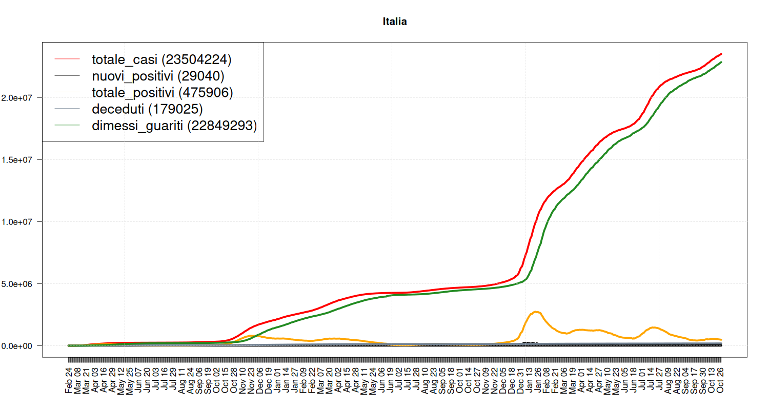
Situation in Italy
Overall Situation
Evolution over time.
my_plot("Italia", national, textlabels=FALSE)
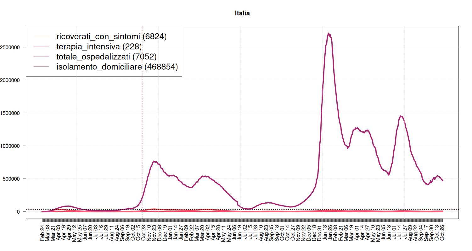
Breakdown of Quarantine
It tells where people with COVID-19 are spending their quarantine, that is, a breakdown of the “yellow” line of the previous plot.
The blue line is the number of people hospedalized during the (first) lockdown. Now the capacity of the health system should be higher, but it seems something to look at (although the situation differs from region to region).
  my_plot("Italia",
          national,
          max(national$isolamento_domiciliare), textlabels=FALSE, filter=FALSE,
          variables=c("ricoverati_con_sintomi", "terapia_intensiva", "totale_ospedalizzati", "isolamento_domiciliare"),
          graphtypes=c("l", "l", "l", "l", "h"),
          colors=c("#FECEAB", "#EC2049", "#E84A5F", "#A7226E"))
abline(h = national[38,]$totale_ospedalizzati, col="#330000", lwd=2, lty=3)
abline(v = as.Date("2020-10-25"), col="#330000", lwd=2, lty=3)
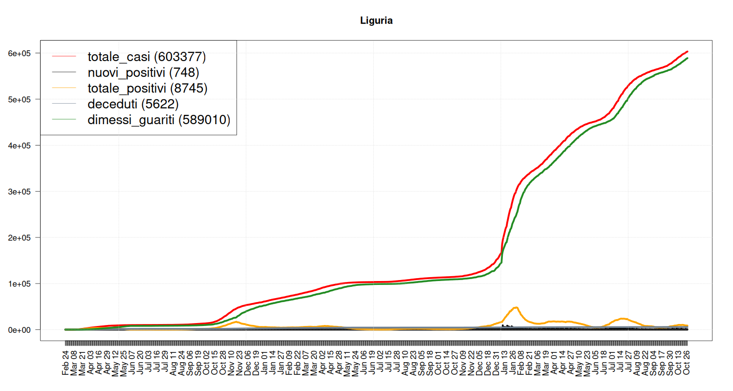
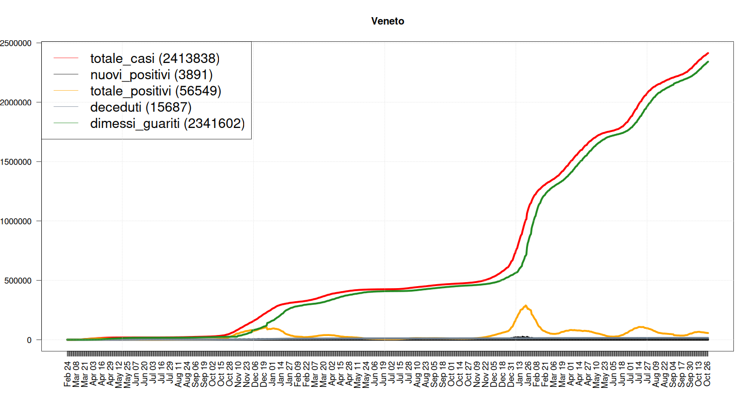
Focus on Trentino, Liguria, Veneto and Lombardia
Situation in Trentino
my_plot("P.A. Trento", data, filter=TRUE, textlabels=FALSE)

Situation in Liguria
my_plot("Liguria", data, filter=TRUE, textlabels=FALSE)
Situation in Veneto
my_plot("Veneto", data, filter=TRUE, textlabels=FALSE)
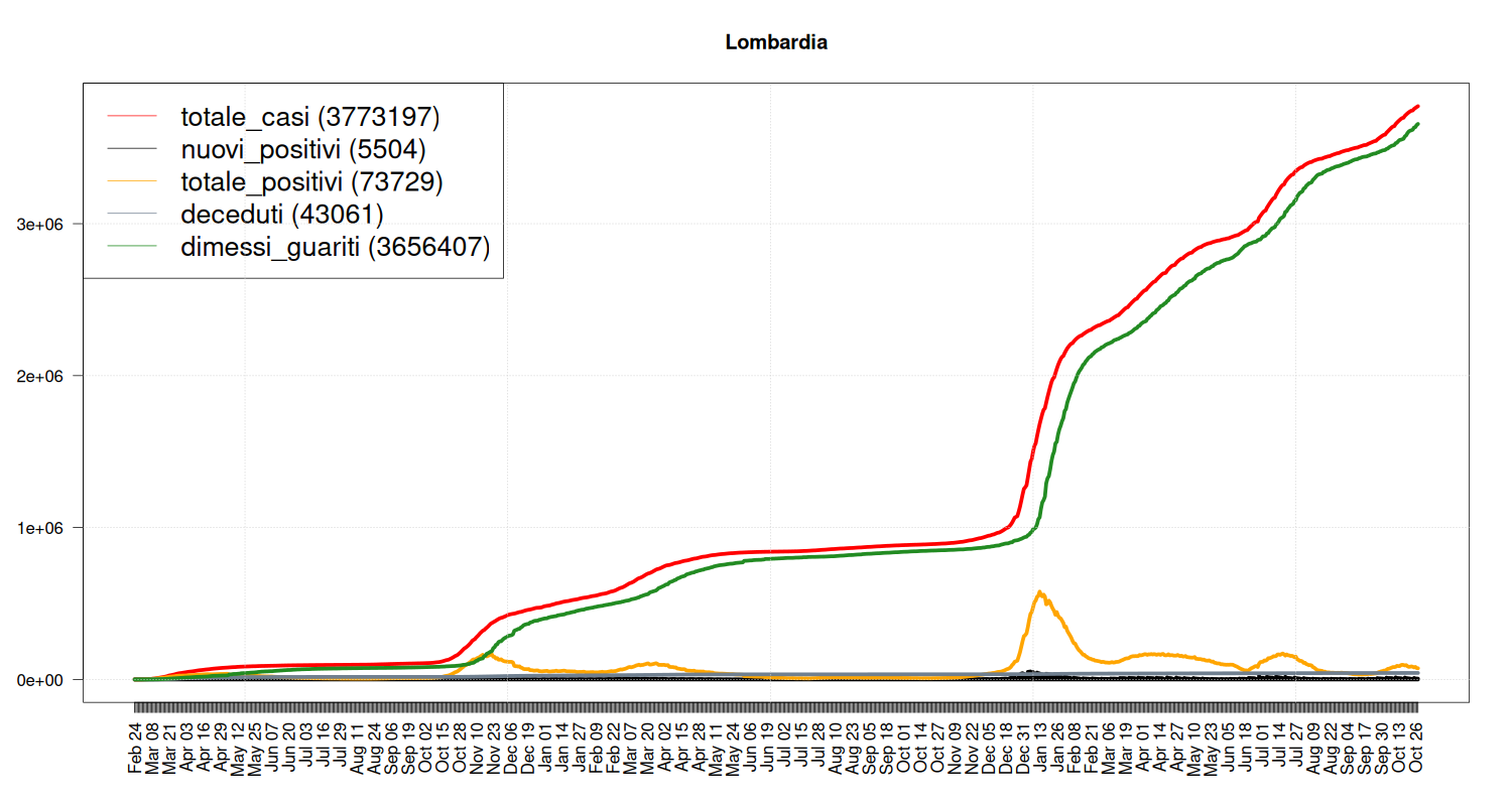
Situation in Lombardia
my_plot("Lombardia", data, filter=TRUE, textlabels=FALSE)
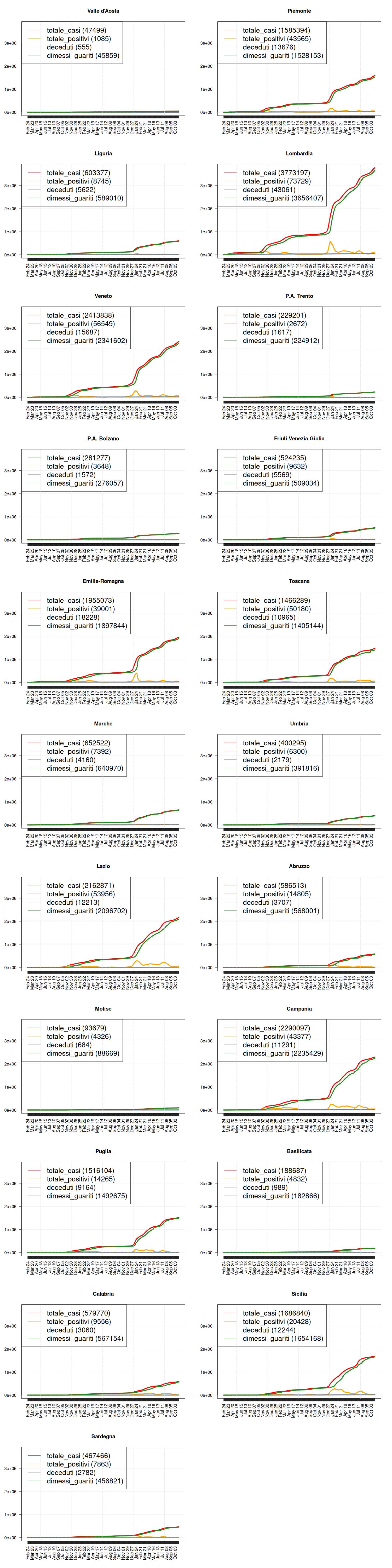
Situation by Region
Situation by Region
# how many rows and columns?
par(mfrow=c(11, 2))

max <- max(data$totale_casi)

regions <- c("Valle d'Aosta", "Piemonte", "Liguria", "Lombardia", "Veneto",
             "P.A. Trento", "P.A. Bolzano", "Friuli Venezia Giulia",
             "Emilia-Romagna", "Toscana", "Marche", "Umbria",
             "Lazio", "Abruzzo", "Molise", "Campania",
             "Puglia", "Basilicata", "Calabria", "Sicilia",
             "Sardegna")
for (region in regions) {
  my_plot(
    region, data, filter=TRUE, textlabels=FALSE,
          variables=c("totale_casi", "totale_positivi", "deceduti", "dimessi_guariti"),
          max = max,
          graphtypes=c("l", "l", "l", "l"),
          colors=c("red", "orange", "slategrey", "forestgreen"))
}
The source code available on the COVID-19 pages is distributed under the MIT License; the content is distributed under a Creative Commons - Attribution 4.0.